PAWPLACES | CONCEPT MOBILE APP | PROJECT OVERVIEW
Gone are the days of asking "Can I bring my dog?"
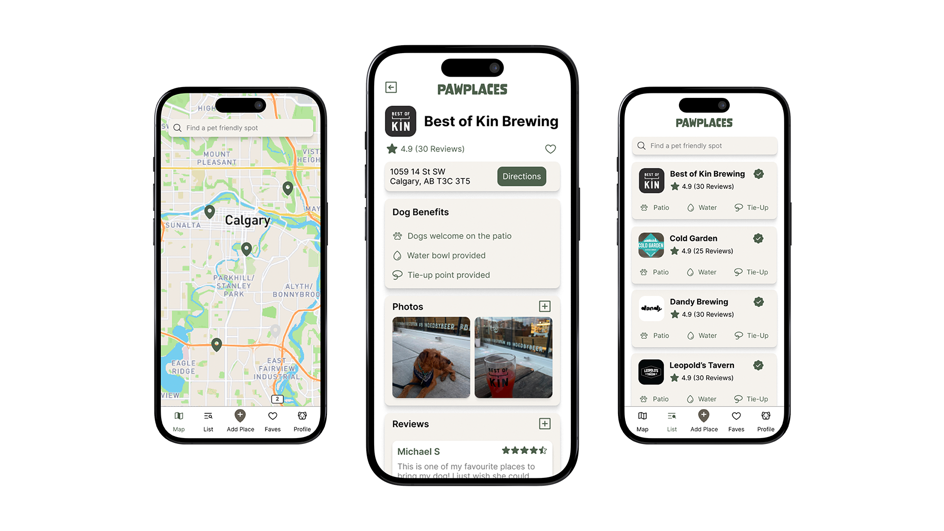
PawPlaces is a concept mobile app that helps dog owners quickly find reliable information about dog-friendly businesses, parks, and trails.
MY ROLE
UX & UI Designer
TEAM
1 UX & UI Designer
TIMEFRAME
12 weeks
TOOLS USED
Fig-Jam
Figma
Maze
Figma
Maze
PROCESS
User research & interviews
Wireframes & prototyping
Usability testing with 6 users
Iteration and reflection
Wireframes & prototyping
Usability testing with 6 users
Iteration and reflection
PROBLEM
Dogs want in on the plans, but it's hard for owners to know if they are welcome.
This often leads to wasting time searching online or contacting businesses directly for confirmation.
RESEARCH INSIGHTS
Missing information
- Owners had difficulty finding reliable and up-to-date information on dog-friendly places.
Outing limitations
- Plans are often hindered by not wanting to leave their dogs in the car in unsafe temperatures.
Limited exploration
- Nerve-racking to try new and unfamiliar places, which discourages city exploration.
SOLUTION
PawPlaces removes the guesswork from finding reliable dog-friendly places.
- An interactive map, list and filters make it easy to find dog-friendly places nearby.
- Detailed business profiles outline what amenities are available for dogs.
- Real user reviews reduce uncertainty and set expectations before visiting.


